Color in close company
Neighboring shades, different surfaces, and the quiet depth of a tonal outfit.

An outfit in neighboring shades has a particular kind of depth. Cream beside a warmer beige, charcoal beside black, a muted brown against a deeper one: the distinctions can be small enough to invite a second look. Dressing tonally gives those distinctions room. Its interest comes from the relationships among the colors and the surfaces that carry them.
Begin with shades you already enjoy wearing. There is little reason to build an entirely new palette before trying the idea. Lay two or three familiar garments together in daylight and notice the result. You may find that pieces you thought belonged to different outfits have a useful conversation once their colors are considered together.
Define a family, loosely
Choose a broad family such as gray, brown, blue, or cream. Allow some variation in warmth and depth. An outfit does not need to match like a uniform to feel connected. In fact, a slight difference can make the arrangement more interesting, provided it appears deliberate to you.
If two shades seem to compete, introduce a clearer distinction. A pale shirt can separate a medium-toned trouser from a darker jacket. Alternatively, remove the third shade and let the difference between two garments become the whole idea. This is an experiment in attention: notice whether the outfit gives you somewhere comfortable to look.
Use surface as a second color
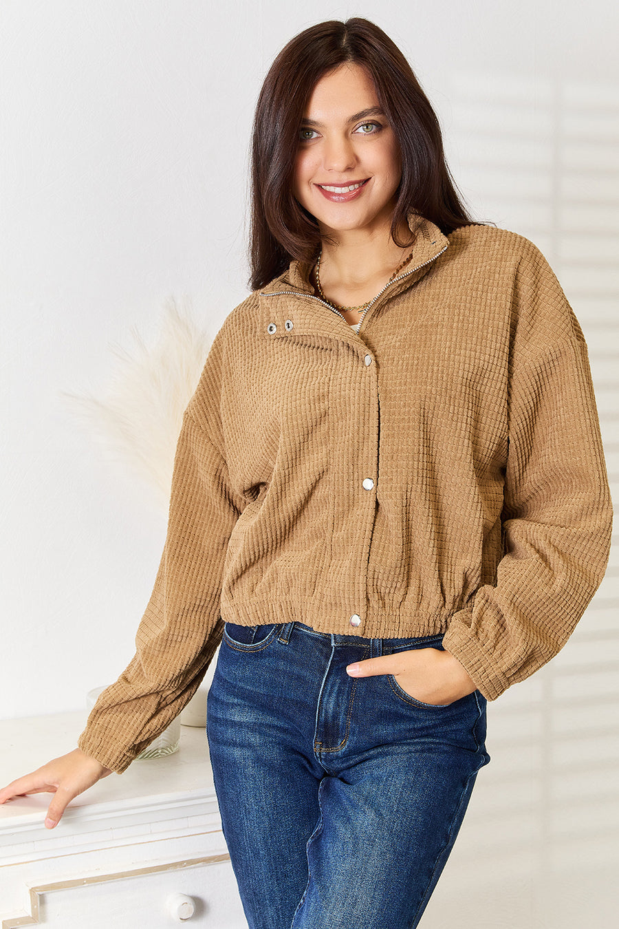
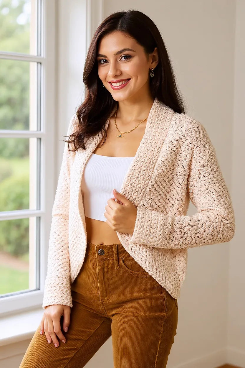
Smooth and textured surfaces reflect light differently, so two garments of a similar shade may remain visually distinct. A visibly ribbed layer beside a plain woven shirt is one useful example. You can also explore matte and slightly reflective finishes, though a photograph alone cannot tell you how a particular garment will feel or perform.
Place those surfaces where you want emphasis. A textured layer near the face can become the main point of interest. A quieter top above a patterned or textured lower half lets attention travel downward. The result need not be balanced in a mathematical sense; it should feel like a choice you understand.

Give contrast a location
A tonal outfit can still include a sharp interruption. A white collar, a dark shoe, or a single printed piece may provide enough contrast to clarify everything around it. Decide where you want that interruption before adding several small accents. Too many disconnected points can make a restrained palette feel surprisingly restless.
You can test this by taking away one contrast rather than adding another. Remove a belt, change a bag, or close a jacket. Look again from a little distance. If the outfit becomes easier to read, the removed detail may have been competing with the part you cared about most.
Check more than one kind of light
Colors seen on a phone or under a bedroom bulb may look different outside. When possible, examine combinations near a window and again in the light where you expect to wear them. This is especially useful with near-black shades and pale neutrals, where small shifts can become more noticeable beside one another.
Product photographs also vary with lighting and screen settings. Read the listed color name and view all available images before deciding that two pieces will match. If an exact match matters, separate online photographs rarely provide enough certainty. Treat the combination as a possibility rather than a promise.
Let the palette belong to your life
Consider how a light or dark palette fits the day. A pale trouser may be a pleasure for one occasion and an unnecessary concern for another. Practical decisions do not diminish the visual idea. They help you enjoy it without constantly monitoring your clothes.
For a first attempt, build a tonal outfit from three pieces you own and wear it on an ordinary day. Notice which combinations stay appealing after the novelty has passed. Record the ones you want to repeat, including the shoes and layer you used. Those details are often what make the palette work.
Color becomes personal through these accumulated choices. You may discover that you prefer a narrow range with one unexpected shade, or a broader family held together by a familiar dark base. Keep the combinations that feel like you. A coherent palette should make getting dressed more pleasurable, while leaving enough room for a change of mind.
Explore the wardrobe
Pieces to explore alongside the story. Stock editorials are separate styling references.
Media credits
Photograph: Leeloo The First / Pexels. Editorial styling reference; garments and fabric pictured are not store products.
Source: https://www.pexels.com/photo/a-woman-in-black-blazer-posing-on-the-road-5900428/
Photograph: Leeloo The First / Pexels. Editorial styling reference; garments and fabric pictured are not store products.
Source: https://www.pexels.com/photo/a-woman-in-black-pants-walking-on-the-street-5900417/
Stock license: https://www.pexels.com/license/