A surface study
A visual essay on texture, contrast, and what a photograph can actually show.

Look at a garment from a few steps away and then bring your attention closer. The overall shape gives way to a surface: ribs, loops, a fine grain, an open pattern, or a smooth area that catches the light. These details can change how a simple outfit reads. They also invite a useful distinction between what you can see and what a photograph cannot establish.
This is a visual exercise in texture, rather than a material-performance test. A close image may show structure clearly, but it cannot tell you how soft a garment feels, how it will recover after wear, or how long it will last. Keep those questions connected to the actual product information and available evidence.
Start with two quiet pieces
Choose garments in neighboring colors so that their surfaces are easier to notice. A visibly textured layer beside a plainer shirt can create depth without requiring a strong color contrast. Put them together and look at how the light moves across each one. The outfit may feel more varied than its limited palette suggests.
Then change one piece to a surface of a different scale. A fine rib and a broader knit create a different relationship from two similarly sized textures. There is no required amount of contrast. You are looking for a combination that gives the eye enough information without making every area compete.
Use the distance of ordinary life
Some textures are most visible close up, while others remain graphic from across a room. Consider both distances. A delicate detail may matter to you even when it is invisible to everyone else. A larger pattern of stitches or ribs can become part of the outfit's overall silhouette.
A photograph taken from a normal distance can help you see the difference. Compare it with a closer view and notice which elements remain legible. This is useful when deciding whether a textured garment should be the main point of interest or a quieter supporting layer.

Read open structures carefully
An open-knit or visibly perforated surface may be photographed over another garment. Check what the listing says about lining and opacity, and look at all available views. Do not assume that the coverage in a styled image belongs entirely to the outer piece. The layer beneath may be doing practical work that is easy to overlook.
If you plan to add your own inner layer, try to understand the neckline, sleeve, and hem relationship as well as the color. A contrasting inner piece can become part of the visual pattern. A closer shade may create a quieter effect. Both require a combination that gives you the coverage and comfort you want.
Let a plain surface remain plain
A textured piece does not need a textured companion everywhere. A smooth area can give the eye a pause and make the detail beside it more noticeable. This is especially helpful when a garment also includes a print, an unusual fastening, or a generous silhouette. One quieter choice can give the stronger one room.
Try removing a layer or accessory before adding another. Look at the whole outfit again and decide whether the surface you enjoy has become clearer. Editing works best when you can identify the relationship that changed, rather than simply concluding that more or less detail is always better.
Keep care in the conversation
Visible texture can affect how you choose to wear and maintain a garment, but follow the actual care instructions rather than a guess based on appearance. Consider the practical interactions with bags, jewelry, and outer layers. If a surface looks open or delicate, inspect the received garment carefully before deciding how it fits into your routine.
The photographed knit study in this issue is editorial stock imagery. It illustrates a visible structure and is not a swatch from a product offered in the store. Keeping that distinction clear allows the image to be useful without suggesting material evidence it does not provide.
Texture can make a familiar palette feel newly interesting. Start with the surfaces you can observe, combine them at a scale you enjoy, and let their practical details remain part of the decision. A wardrobe gains depth when its clothes offer different things to look at and remain comfortable enough to wear.
Explore the wardrobe
Pieces to explore alongside the story. Stock editorials are separate styling references.
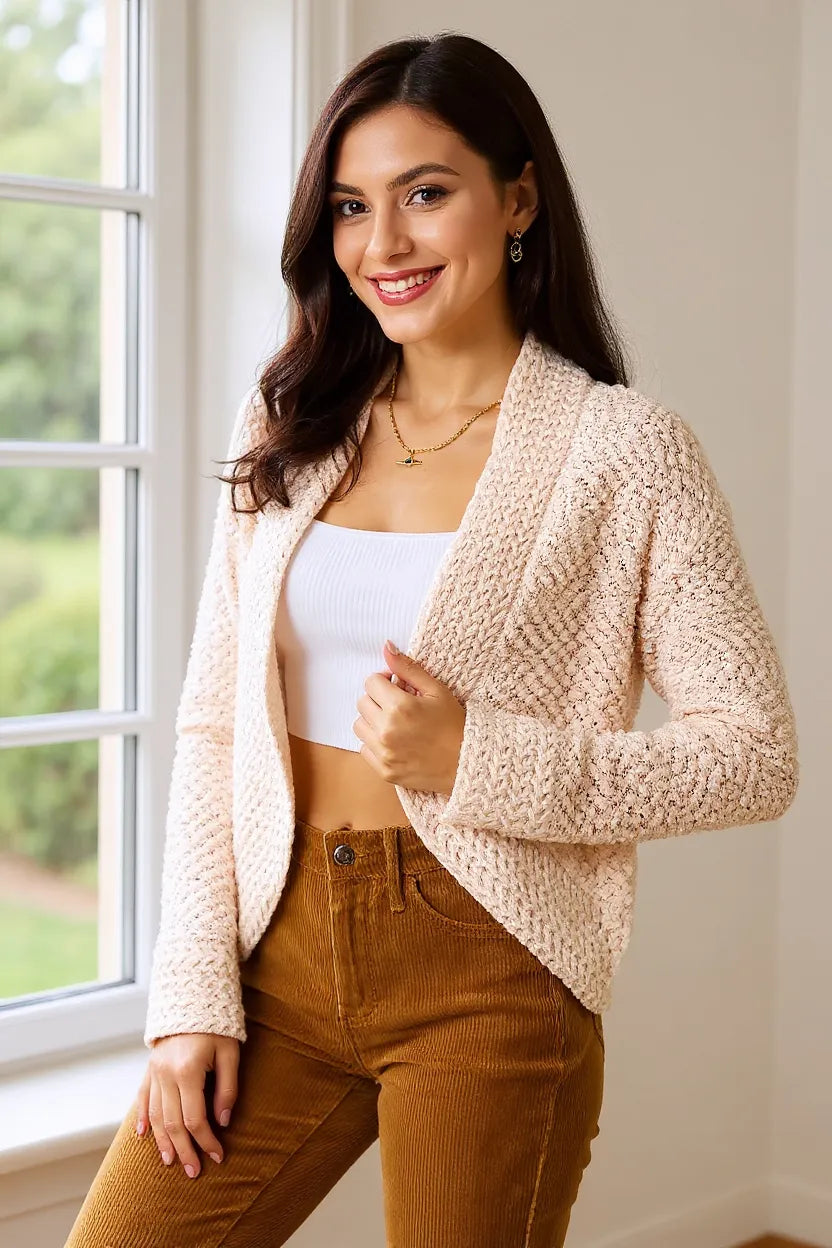
Open Front Cardigan — Cream
$36.00
Ribbed-Trim Open-Knit Top
$26.00Media credits
Photograph: Artem Podrez / Pexels. Editorial styling reference; garments and fabric pictured are not store products.
Source: https://www.pexels.com/photo/close-up-shot-of-a-beige-knit-textile-7232403/
Photograph: Artem Podrez / Pexels. Editorial styling reference; garments and fabric pictured are not store products.
Source: https://www.pexels.com/photo/close-up-shot-of-a-beige-knit-textile-7232403/
Stock license: https://www.pexels.com/license/